Why do modern blockbusters all look alike?
Why do modern blockbusters look so samey? In the modern franchise age, why do all these nine-figure epics feel so visually limited?

The latest updates, reviews and unmissable series to watch and more!
You are now subscribed
Your newsletter sign-up was successful
Want to add more newsletters?
Modern blockbuster filmmaking has seen exceptional technological advances as well as the immeasurable growth of the medium to the point where it now forms the foundations of modern Hollywood. Before the COVID-19 pandemic changed the game irrevocably, we were in the midst of a period of seismic change for the film industry thanks to these mega-budget tentpole titles. Last year, nine of the top ten highest-grossing films of 2019 brought in over a billion dollars worldwide, and every single movie in that list was either a sequel, reboot, or new addition to a multi-film franchise. There were now exceptions, and almost all of them cost, at the very least, $100 million. Once upon a time, that number was considered the rarest of luxuries for a studio, the kind of investment that inspired shocked headlines. Now, it's considered "low-budget". It's startlingly common to see films with reported budgets exceeding $250 million. Last year, Avengers: Endgame had a mind-boggling budget of $356 million, although it clearly paid off as it became the highest-grossing film of all time. This is the new normal: Wildly expensive franchise fare that is too big to fail and will dominate the pop culture landscape for years to come.
So, why do so many of these films look, to put it kindly, somewhat dire?
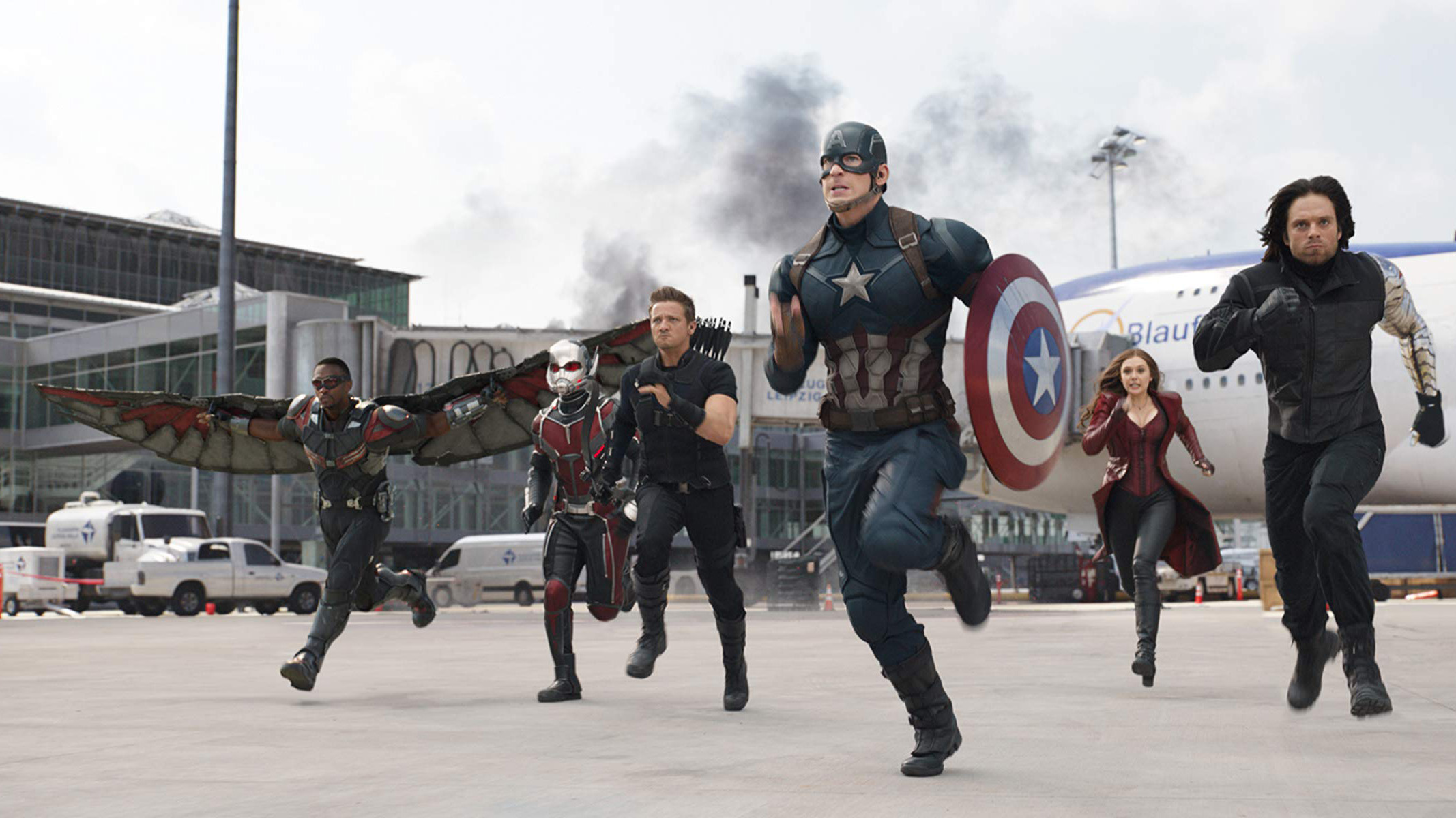
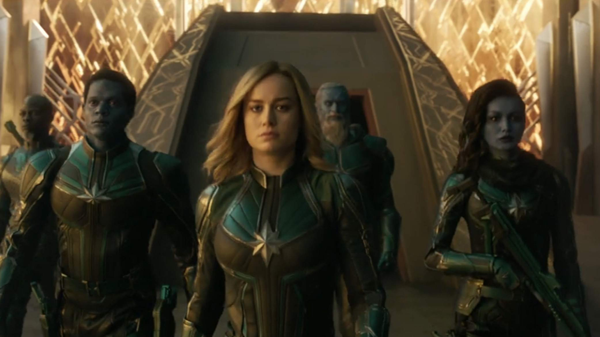
Many a joke has already been made about the samey aesthetics of these $200m+ expanded universe installments: the strange over-reliance on blue lightning shooting through cloudy skies; the sea of beige and brown that defines the color palates of so many of these stories; oddly flat lighting; a distinct allergy to anything remotely vibrant or “unreal.” Indeed, we now expect it so frequently, are so ready for it to be the default mode for these movies, that we barely notice it. The orange and teal contrast is now infamous among film fans, with ECG Productions noting that the overused color choices are commonly utilized in blockbusters as a way to make action scenes look their best. It’s a disheartening development that only further exacerbates the seemingly never-ending discourse surrounding blockbuster cinema that has exhausted us. Everything looks the same, whether it’s a Star Wars movie, a Disney remake, a lavish superhero tale, or even Cats. They’re all cut from the same cloth of aesthetics.
Article continues below 
We see this issue most obviously in films like the continuing assembly line of Disney’s remakes of its beloved animated classics. Consider the 2017 remake of Beauty and the Beast, based on the film that is widely considered to be one of Disney’s greatest animation achievements. The original is so effervescent in its visuals, full of colors and textures that enliven its narrative. By contrast, Bill Condon’s remake, which had a reported budget of $255 million, was flat, drab, and decidedly unmagical. Costumes and CGI characters were more ornate in their detailing, but it didn’t make them seem prettier or more interesting than the original designs. They couldn’t really differ much from those familiar images because Disney had corporate synergy to maintain (another crucial aspect as to why these films all look so derivative: they have to stick closely to the familiar nostalgic source material as a means of strengthening the brand and trademarks.)
This problem also reared its ugly head with last year’s The Lion King, which cost a reported $250 million. Sure, it was impressive to see photorealistic lions, but the moment they had to talk with human voices, the illusion cracked, and you were instantly reminded of how lifeless and flat it all looked. Stylistically speaking, most of these films are aiming for realism, or at least a highly polished version of it suited to cinema. Admittedly, it is stunning to see how far CGI has come, to the point where we’re no longer impressed by the sight of an entirely digital world. The downside to this advancement is a further embracing of this derivative aesthetic, all in the name of looking “real.” Bright colors are discarded, for example. The expressive joys and limitless nature of the medium is ignored in favor of something that no longer astounds us. It is assumed that audiences want this bastardized version of “real” over the qualities that won us over the first time round. It doesn’t seem to dawn on any of these studios that striving for the dullest form of realism in movies centered on intergalactic battles, fairytale princesses, and talking cats may be somewhat misguided.
Every moment of these movies is predetermined before anyone ever cries "action", thanks to pre-visualization software, to the point where you wonder why a director and their crew are even needed. The same applies to fight scenes, which goes a long way to explaining why we have a solid decade of superheroes fighting baddies in the same darkened alleys with the same sets of moves. Tools like this are necessary when so much money is on the line, but it doesn't exactly encourage experimentation or creative choices outside of the narrowly expected norm. This is the consequence of too-big-to-fail filmmaking and the blockbuster market currently ruling its domain.
It’s hard to avoid the labor aspects at play with such creative failings. VFX workers and studios are notoriously overworked and underpaid in Hollywood, given the tightest of deadlines to complete the most intricate work at ridiculously reduced costs. The mistreatment of VFX teams has been extensively documented. The studio behind the oft-lauded effects on the remake of The Lion King was forced to shut down due to lack of funds. Studios pit companies like these ones against one another, forcing them to bid low to get the job and freelancers to work for decreased wages (there's no VFX union.) The Lion King was the second-highest grossing film of 2020 but the people who made it happen weren't even fairly compensated for it. Hollywood has become dependent on this visual aesthetic but has no desire to treat the hundreds of talented FX artists who make it happen with dignity.
The latest updates, reviews and unmissable series to watch and more!
It doesn’t seem unreasonable to expect more from the likes of Disney with such films. After all, they are so immensely powerful and influential, dominating a major (and deeply questionable) share of the market, and surely audience standards should reflect that? It’s a disheartening development for these wildly expensive films, the ones that now wholly define mainstream pop culture to the worldwide masses, to view the basic building blocks of storytelling as artistic non-entities.
It’s not all doom and gloom. Get the right director in charge – and a studio with enough patience to make it happen – and you can see blockbusters that burst out of the modern mold in big ways. Consider the striking use of color and fluid camera work of Rian Johnson’s Star Wars: The Last Jedi or the near-kaleidoscopic vibrancy of the giant robots and monsters in Guillermo del Toro’s Pacific Rim. A lot of work goes into making these films and directors and their crews are burdened with such immense expectations, but that shouldn’t mean that audiences should so willingly swallow beige mediocrity. If we are to be swamped under by sequels, reboots, expanded universes, and glossy big-budget IPs, then the very least we should expect is some diversity of image.
Kayleigh is a pop culture writer and critic based in Dundee, Scotland. Her work can be found on Pajiba, IGN, Uproxx, RogerEbert.com, SlashFilm, and WhatToWatch, among other places. She's also the creator of the newsletter The Gossip Reading Club.


